Infinite Lens Gallery
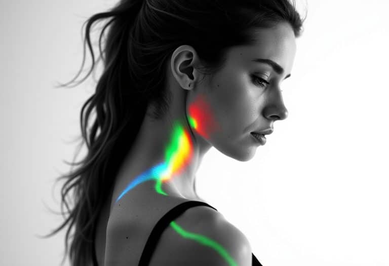
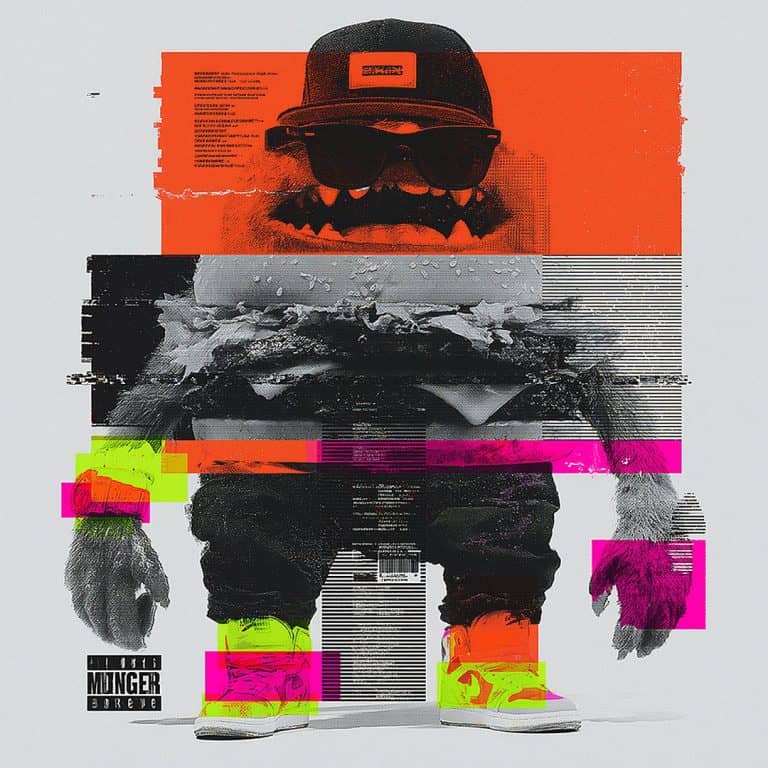
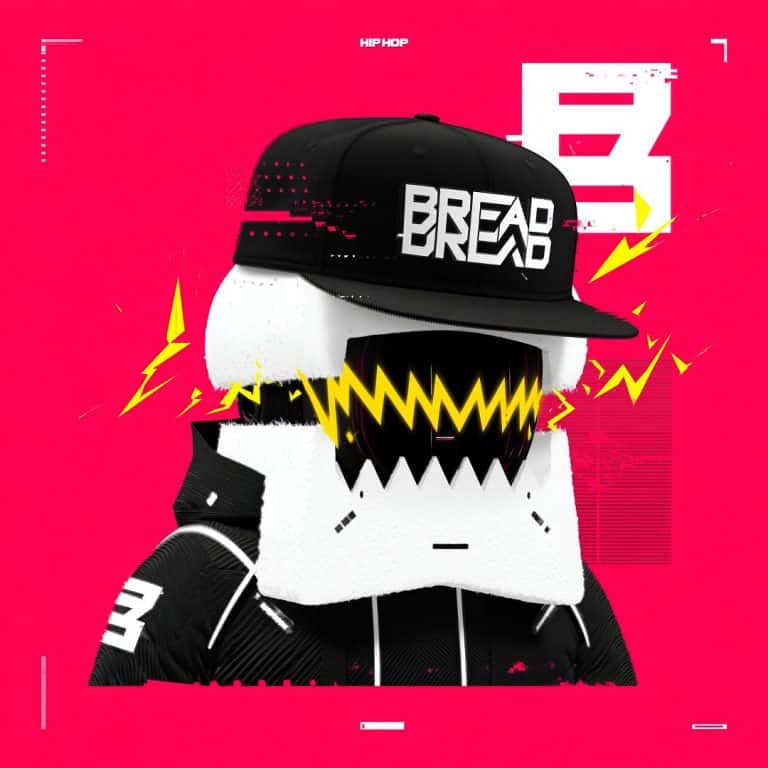
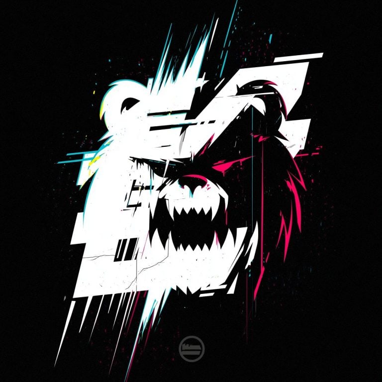
Infinite Lens Gallery turns a simple set of images into a seamless, endlessly scrolling wall of cards that you can drag or scroll in any direction, with a subtle lens warp that makes the whole grid feel like it’s bending under a magnifying glass as you move it. It’s smooth and dependency-free, and it automatically respects the `prefers-reduced-motion` setting, toning down the motion and effects for users who prefer a calmer experience.













Another Landing Page in the Void
Statistically, you'll bounce. We've made peace with it.
Our Mission Statement Is Under Revision
Draft 1 was "be a company." Bold. Ambitious. Wrong.
Instructions
Open the JS script in the Supa Code Block element and edit the options at the end of the script. Each option is explained below:
Layout options
selector (string) A CSS selector pointing to the container element the gallery will be injected into. The script runs document.querySelector(selector) on it, and if nothing matches, it logs a warning and returns null. Defaults to '.bde-rich-text-2811-118' (a placeholder that gets replaced when this is used as a template).
gapVw (number, default 2.5) The gap between cards, measured in viewport-width percentage units (vw). So 1.0 means the spacing between cards equals 1% of the viewport width. It scales automatically as the window resizes.
cardWidthVw (number, default 24) The width of each individual card, again in vw units. 33.5 means each card is 33.5% of the viewport width wide. The card height is derived from this plus cardAspect.
cardAspect (number | 'auto' | null, default 1) The width-to-height ratio of the cards. 1 gives squares, 0.8 gives portrait cards (as in your example), 1.5 would give landscape ones. If you pass 'auto' (or null/undefined), the aspect is taken from the first image's natural dimensions. Values are clamped between 0.2 and 5.
cornerRadius (number, default 0.08) Rounds the corners of the cards. It's expressed in card UV space, where 0.5 is the half-width of the card, so 0.08 is a subtle rounding and 0.00 (as in your config) gives sharp square corners. Values are clamped to a maximum of 0.5.
Appearance options
saturation (number, default 1) Controls color saturation of the card images in the shader. 1 leaves colors untouched, 0 renders them fully grayscale, and values above 1 oversaturate them. It works by mixing each pixel's luminance with its original color.
backgroundColor (string, default '#ffffff') The background color behind the cards. Accepts hex strings in either 3-digit (#fff) or 6-digit (#0f0f0f) form. It's used both for the WebGL clear color and as the canvas's CSS background.
Lens effect options
lensStrength (number, default 0.5) How strongly the lens distorts the scene. Positive values bulge the image outward (magnifying-glass style), negative values pinch it inward — your example uses -0.29 for a concave/pinched look. The value is clamped between -0.9 and 0.9 in the shader, and the effect fades smoothly toward the edges of the lens area.
lensRadius (number, default 1.4) The size of the lens region. It's the radius (relative to screen space, aspect-corrected) within which the distortion applies. Larger values spread the effect across more of the screen; smaller values concentrate it near the center.
zoom (number, default 1.0) Additional magnification inside the lens. Values above 1 zoom in on the content (your 1.12 slightly magnifies), values below 1 zoom out. It's applied after the bulge/pinch distortion.
lensCA (number, default 0) The amount of chromatic aberration — red and blue channels get offset in opposite directions, creating color fringing. Importantly, in this implementation it's multiplied by an internal "speed boost" value (uCASpeed), so the fringing only appears while the gallery is actively moving and fades out when it settles. 0.00 disables it entirely.
grain (number, default 0) Film-grain noise intensity. It adds animated noise (re-randomized 24 times per second) to the final image. 0.00 disables it; higher values make the noise more visible.
Behavior options
wheelScroll (boolean, default true) Whether the mouse wheel pans the gallery. When true, wheel deltas move the grid and add inertia; when false, the wheel event is left alone so the page scrolls normally.
disableOnMobile (boolean, default true) When true, all interactivity (dragging, wheel, skew, inertia) is disabled on viewports 768px wide or narrower. In that "static mode" the gallery renders once as a fixed image, touch scrolling passes through to the page, and the cursor is default. It re-evaluates automatically on resize, so rotating a device or resizing across the 768px threshold toggles it live.
onItemClick (function | null, default null) A callback fired when the user clicks/taps a card — but only if the pointer moved less than ~6px between press and release (so drags don't trigger it). It receives an object like { index: 2, image: <img element> }, where index is the position of the image in the original DOM and image is the actual <img> element.
reducedMotion (boolean | null, default null) Controls accessibility-related motion reduction. When null (the default), the gallery auto-detects the user's OS/browser setting via the prefers-reduced-motion media query and reacts live if it changes. true forces reduced motion regardless — meaning no inertia after flicks, no skew effect, no chromatic-aberration boost, no grain animation, and near-instant snapping when dragging. false forces full motion even for users who prefer reduced motion.
One extra note
There's also a pseudo-option, refreshImages, that isn't meant for the initial config. It's used with the instance's setOptions() method (e.g., gallery.setOptions({ refreshImages: true }) or the refreshImages() shortcut) to re-scan the container for <img> elements and re-upload them — useful if you've added or changed images after initialization.